Margins should be reported in tables and then supported with imagery. An expected image is the fringe plot of stress, strain, or perhaps deflection. This image is what most people perceive as the primary output of finite element analysis, but presented alone often provide misleading and partial data.
Fringe plots (contour plots) should be shown to identify where the high stress regions are for a given load case. The color bar should be discretized to aid in the understanding how large an area of a certain stress level is. The color bar should have a reasonable number of levels (i.e. 10-20). Usually the defaults are fine. The background should be white to allow for good printing (no color gradient or black background). This includes pictures for PowerPoint presentations as they usually get printed out too. Feel free to rescale the color bar to a meaningful set of numbers. The top number should usually not be the highest value reported. Make sure the post processor does show you the maximum value, usually identifying the area directly (with a number). It’s always nice to be able to see the date generated, what file the results are from, etc.
Element edges should be turned on so you can see the type of element and mesh density in the region of interest. If the element edges overwhelm the colors trying to describe the stresses, turn them off for the big picture view and then zoom in and turn them on for a detailed view.
Remove elements from the calculation that are high due to modeling technique (singularities). This will include areas where point loads are introduced, elements attached to rigid elements or near spring connections representing fasteners (among others).
A good measure of if your charts and tables are providing the correct information is if no one is grabbing a calculator or doing math on the numbers you present. If everyone is computing a ratio of your results, compute that ratio for them and report it directly.
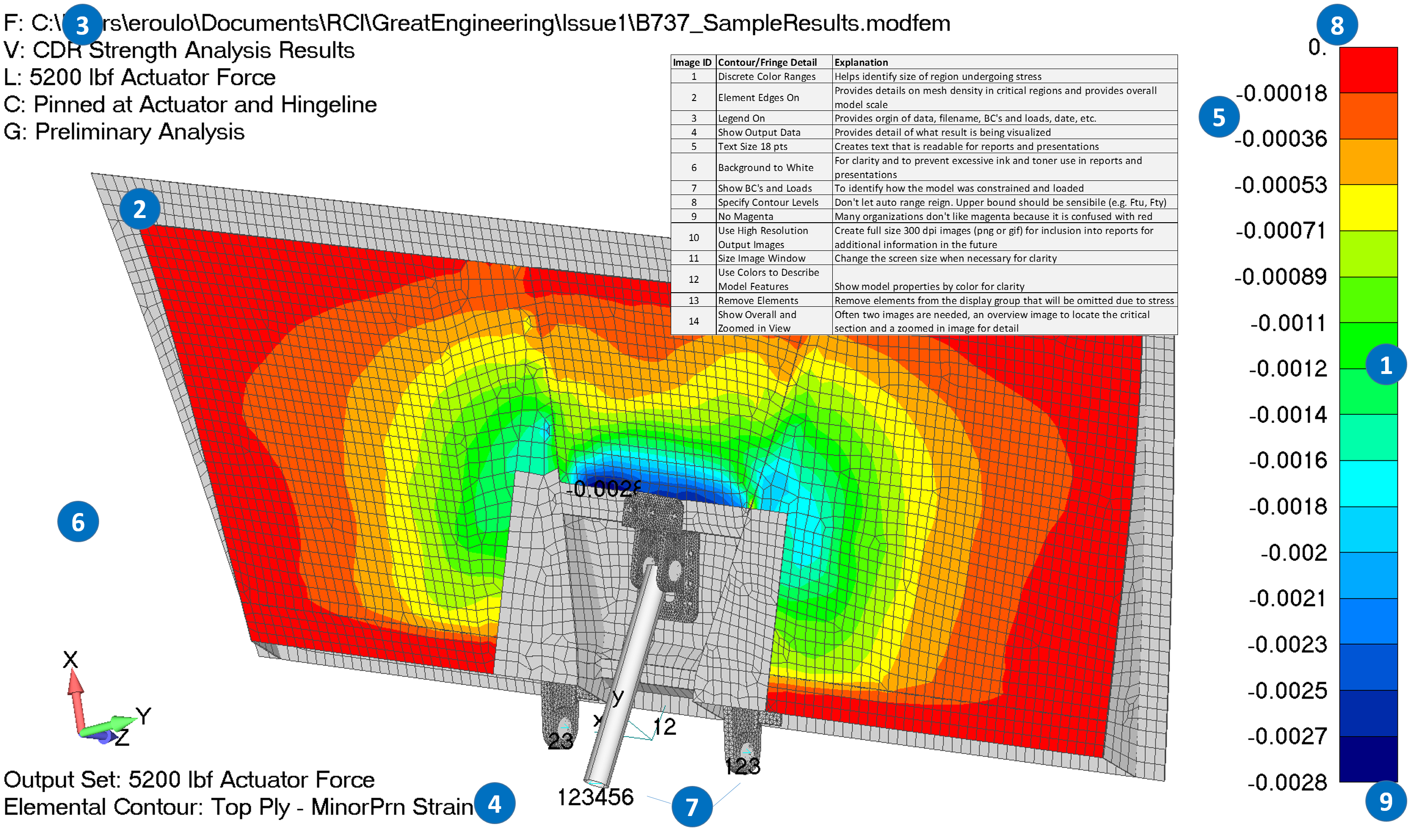
The following Guidelines are a good start for effectively presenting contour/fringe plots:
- Discrete Color Ranges (level colors)
- Element Edges On
- Legend On
- Show Output Data
- Text Size 18 pts
- Background to White
- Show BC’s and Loads
- Specify Contour Levels
- No Magenta
- Use High-Resolution Output Images
- Size Image Window Appropriately
- Use Colors to Describe Model Features
- Remove Elements
- Show Overall and Zoomed in View
-ejr